透明的地方色:郭柏川回顧展 明信片
「透明的地方色」乃是以郭柏川作品的透明性(transparency)作為一種視覺型態,也就郭柏川一生的多重文化經驗,提出對地方色彩論的反思,嘗試還原郭柏川畫風的在地內涵與獨創意義。
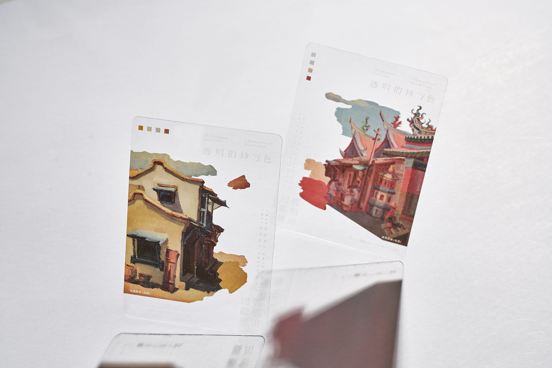
明信片運用材質透明的特性,讓使用者可以在觀賞畫作的同時,體驗郭伯川的作品精神;也能於步出美術館後,送出屬於臺南的色彩。
品牌∣ 臺南市美術館
設計∣ 25degreestudio
年份∣ 2019
類別∣ 明信片 / 禮品設計 / 展覽周邊設計
紙材 | PVC
加工 | UV印刷
印刷 | 右腳設計
明信片運用材質透明的特性,讓使用者可以在觀賞畫作的同時,體驗郭伯川的作品精神;也能於步出美術館後,送出屬於臺南的色彩。
品牌∣ 臺南市美術館
設計∣ 25degreestudio
年份∣ 2019
類別∣ 明信片 / 禮品設計 / 展覽周邊設計
紙材 | PVC
加工 | UV印刷
印刷 | 右腳設計
Transparent Local Color: A Retrospective of Kuo, Po-Chuan postcard
“Transparent Local Color” treats the “transparency” of Kuo’s oeuvre as a visual form. Tracing Kuo’s lifetime experience of multiple cultures, this exhibition also seeks to stimulate cogitation upon the idea of “local color,” thereby restoring the local implication and particular significance of Kuo’s sui generis painting style.
The postcard uses the transparent nature of the material, which allows users to experience the spirit of Kuo’s works while enjoying the painting. Furthermore, they can mail out the colors of Tainan after they depart from the museum.
Brand∣ Tainan Art Museum
Design by∣ 25degreestudio
Year∣ 2019
Category∣ postcard / gift design / exhibition surrounding design
Material| PVC
Processing| UV printing
Printing| rfoot x print
