大潤發 中崙店指標系統設計
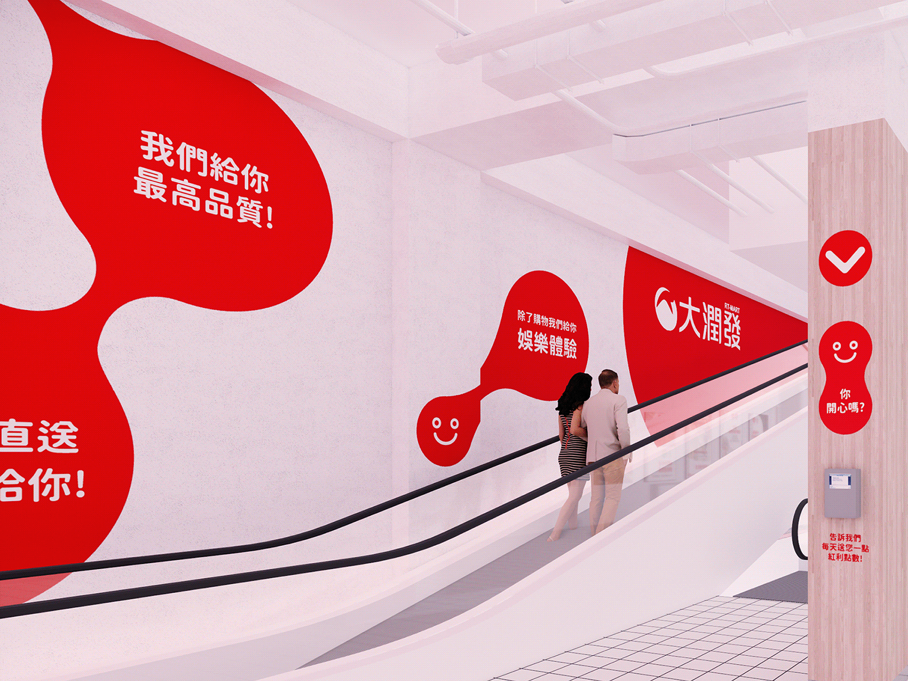
大潤發品牌Logo幻化為紅色地球,作為購物旅程出發點,設計圓潤幾何圖像,視覺上傳遞親和感,更加融入消費者生活。
以直覺、帶有親和力的方式主動傳遞訊息,和消費者產生對話般的互動,為本次指標系統設計概念核心,讓消費者在賣場中能迅速找到自己的方位。
品牌∣ 大潤發 中崙店
指標規劃∣ Nonscale Design / 長短樹鄉村研究所
視覺設計∣ 25degreestudio
年份∣ 2020
類別∣ 視覺設計 指標系統設計
RT-Mart Wayfiding Signage Design
The RT-Mart brand logo is transformed into a red sphere. As the starting point of a shopping journey, the round geometric image is designed to convey a sense of affinity visually and to be more integrated into consumers' lives. Using intuitive and friendly approaches to actively pass on messages and converse with customers is the core of the signage system design, allowing consumers to quickly find their locations in the market.
Brand∣ RT-Mart Zhunglun Branch
Signage planning∣ Nonscale Design / studiotngtetshiu
Visual design by∣ 25degreestudio
Year∣ 2020
Category∣ visual design, signage system design