臻紅國際 JH International
臻紅名稱來自於閩南語”真的紅”,以公益角度在數位平台促進台灣生物科技產業,提供機會給本土族群。
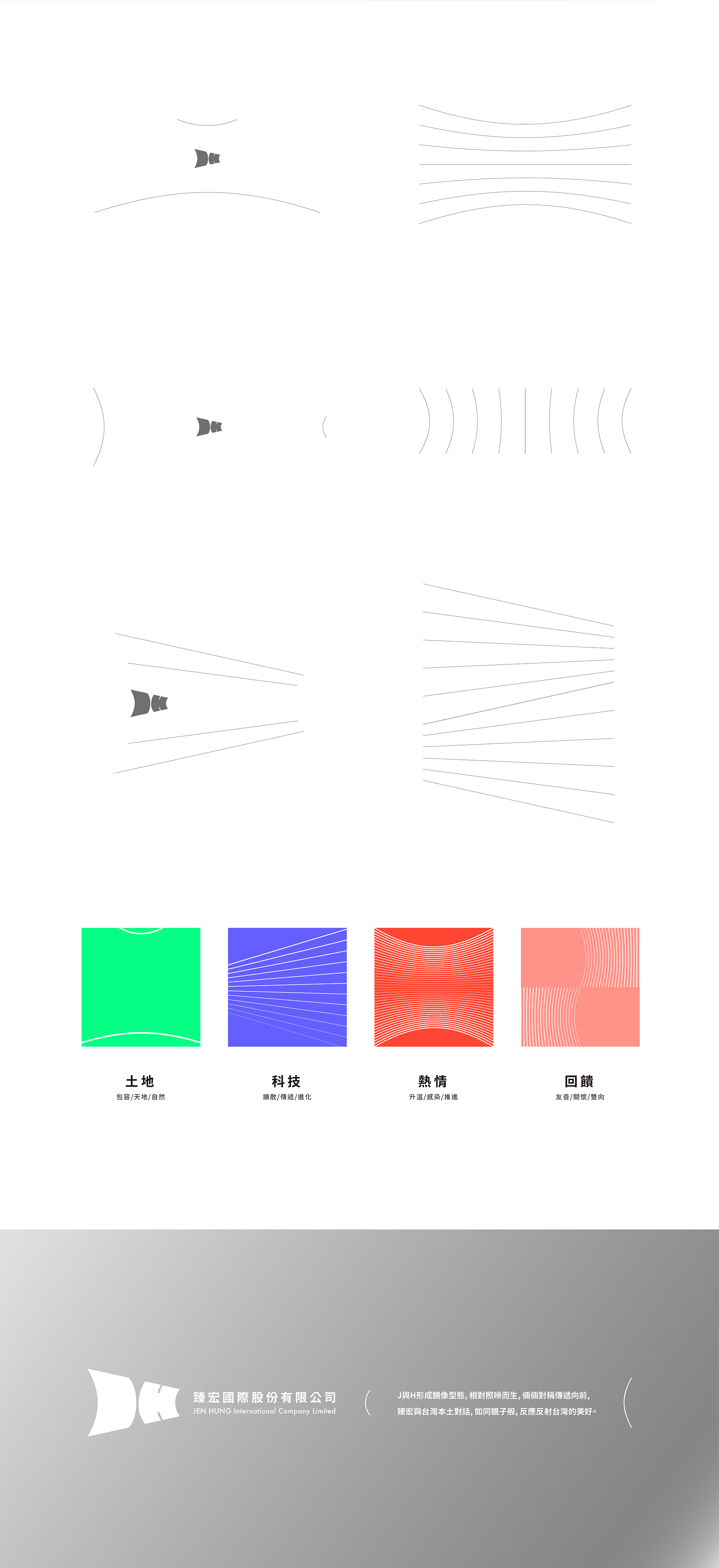
品牌設計以( )型態變形,融會大聲公與聚光燈意象,波型動態傳遞科技氛圍,傳達JH International聚焦台灣,投射未來之意向。
品牌∣ JH International
設計∣ 25degreestudio
年份∣ 2020
類別∣ 品牌系統設計 吉祥物設計
JH International
The name JH comes from the Minnan pronunciation of “really red”, promoting Taiwan's biotechnology industry on digital platforms from a public welfare perspective, providing opportunities for local communities. The brand design draw inspiration from the parentheses (), and uses the images of a loudspeaker and spotlight. Using the wavy and dynamic technology aura, the logo tells its intentions of JH International focusing on Taiwan as well as its intentions for the future.
Brand∣ JH International
Design by∣ 25degreestudio
Year∣ 2020
Category∣ brand system design / mascot design