Kose 雪肌精護膚道具
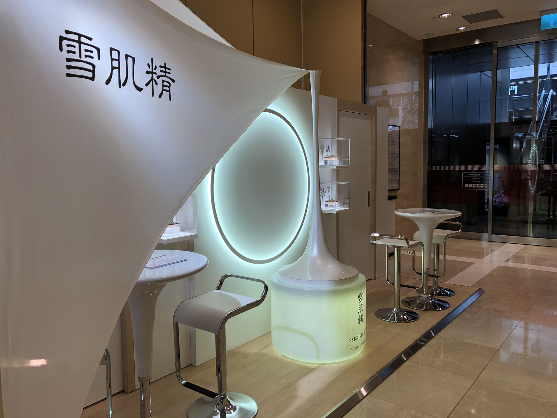
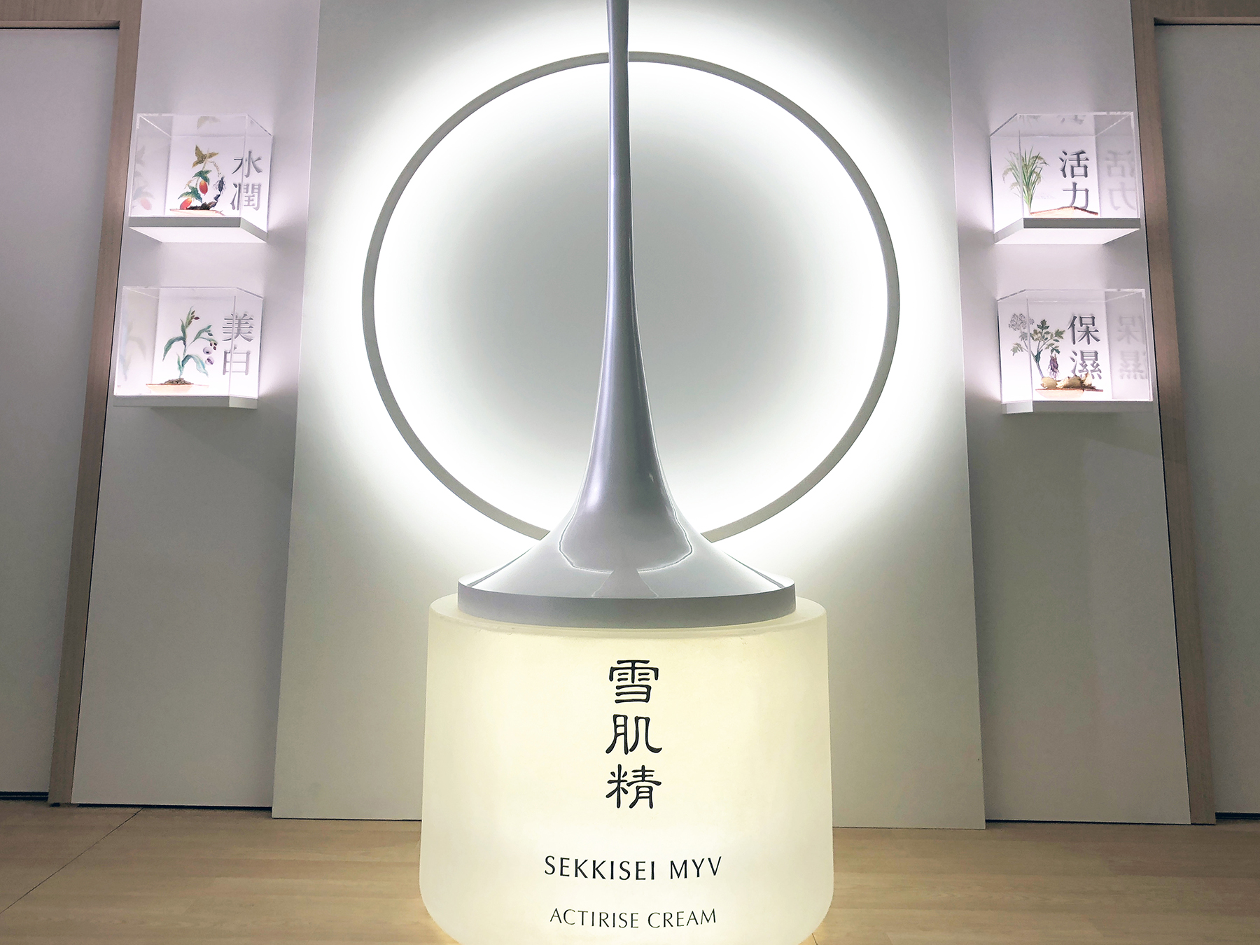
雪肌精品牌強調極致的透明感、彈力。
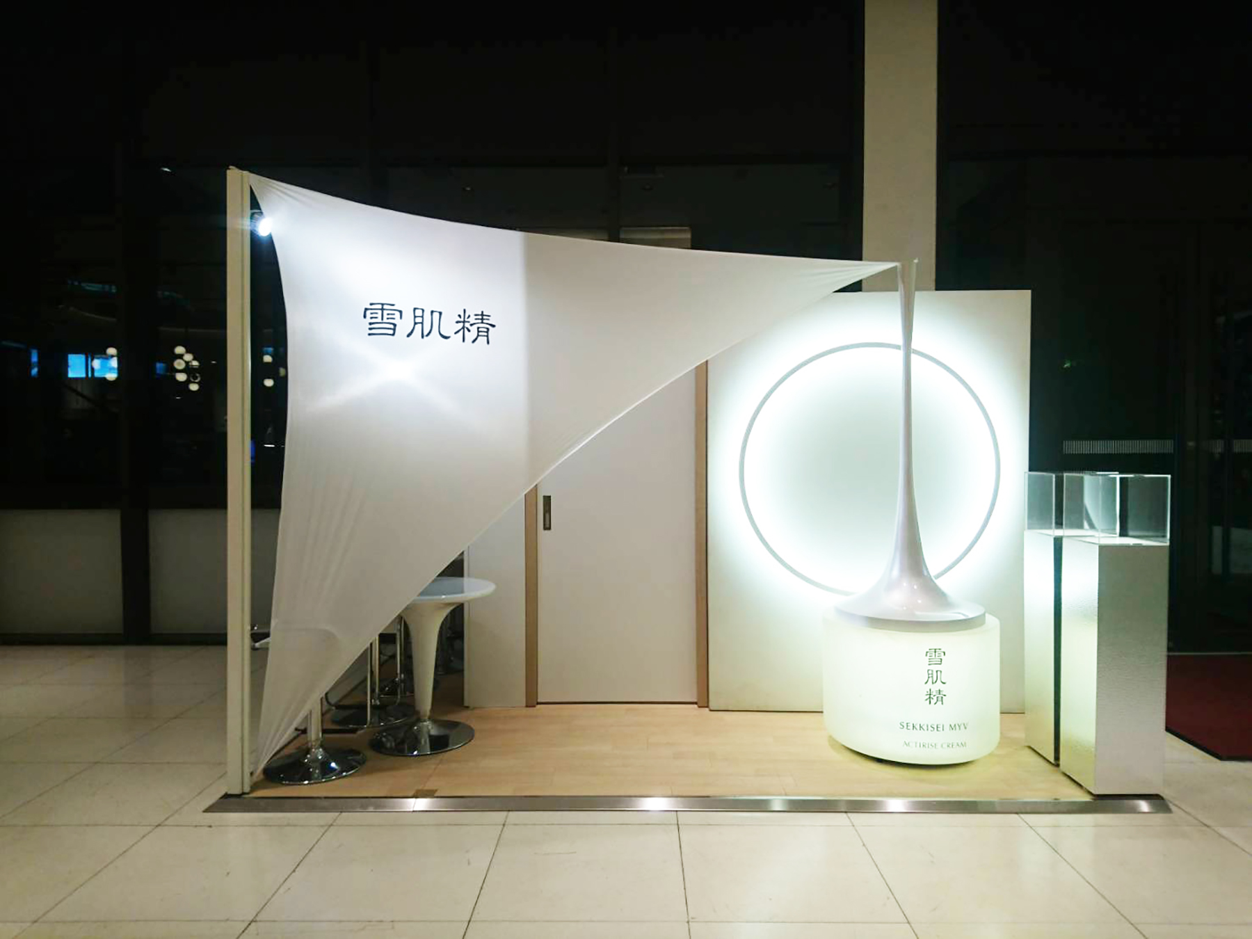
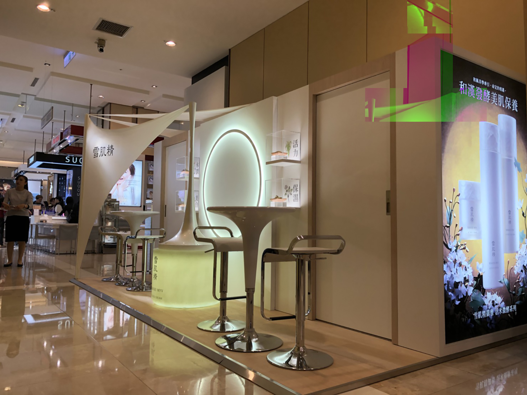
半透瓶身撐起布幔,絲綢般的半透明布延伸整個場域。柔滑布面與圓結合,拉成緊緻滑順的自然曲面,溫暖的光亮與陰影猶如大地精華由內而外透出,展現品牌源自日本「雅」的精神。
本次道具為拆裝式結構,進行為期一季的全省巡迴護膚活動。
品牌∣ Kose
企劃∣ 麥肯廣告
設計∣ 25degreestudio
年份∣ 2019
類別∣ 視覺設計 / 活動空間設計 / 組合式道具設計
Kose Sekkisei skin care tools
The Sekkisei brand emphasizes ultimate transparency and elasticity.
The semi-permeable bottle supports the cloth curtain, and the silk-like translucent cloth stretches out to the entire venue. The silky fabric surface is combined with the sphere, pulling into a compact and smooth natural surface. The warm light and shadow resemble the essence of the earth, showing the brand's spirit of "Ya" originated from Japan. This time, the props are can be taken apart and reassembled, and a one-season tour of skin care activities will be carried out across the country.
Brand∣ Kose
Planning| McCann Erickson
Design by∣ 25degreestudio
Year∣ 2019
Category∣ visual design, event space design, collapsible prop design